Almost all humans, regardless of culture or literacy level, absorb information best when it’s presented visually. Advertisers know this well: they want us to buy what they’re selling, so they must grab our attention quickly using colorful, creative, emotional images that persuade us to act immediately. This is even more important currently, given how quickly people scroll and are bombarded with ads and shows.
Visuals can include posters, memes, slides and photos.
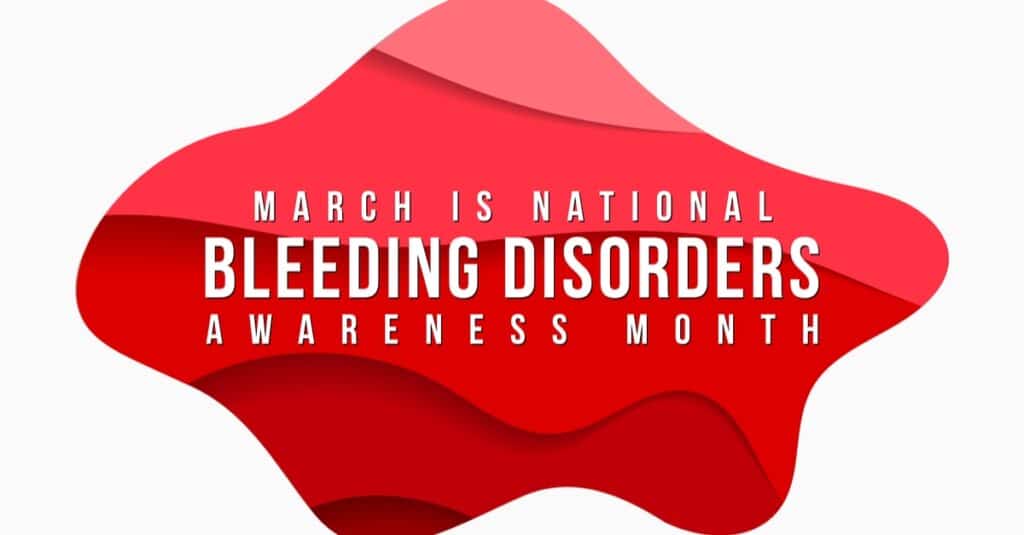
When does the bleeding disorder community use visuals? Well, it’s March—Hemophilia Awareness Month, now referred to as Bleeding Disorders Awareness Month. You might be trying to get people’s attention to educate them about hemophilia, in order to secure donations, or to advocate for better health care. Visuals get attention: they can help educate. But mostly, they can or should generate emotions. You need to decide what emotions you want to generate with your visual.
Here are a few tips for creating effective visuals:
Photos: Be sure to capture life and movement—children are always captivating—and varying camera angles. Avoid long-distance shots. Place photos in several locations on the page, or angled to create interest. Don’t overdo it! Graphics can be fun, but may clutter the page. The more photos, the less effective they are. Keep them to a minimum so your readers can easily absorb your information.
Color: Certain emotions can be associated with certain colors. Red is the color universally used in the bleeding disorder community for obvious reasons. But look at these and ask: what emotions do I want felt when people look at my visual?
Red: power, danger, intensity, life, impulsiveness, blood, passion, speed
Orange: power, energy, fire, warmth, cheerfulness
Blue: calm, peace, tradition, spirituality, water
Green: growth, health, money, balance, quiet, nature, environment
Black: power, authority, mystery, evil, death
Gray: elegant, established, classic, mature, intelligent
Yellow: wisdom, warmth, cheerfulness, idealism, caution, energy, speed
Brown: earthy, basic, simple, plain, natural
White: pure, peaceful, cold, clean, honest
Purple: royal, valuable, ceremonial, traditional
Typeface: Even though you may be designing a visual, you may use some words. Typeface refers to a distinct design of characters and symbols, and fonts, like Arial or Times New Roman. Typeface is available in different weights and styles. Weight refers to the thickness of lines used to form the letters; heavier weights are thicker and look darker. Style or font refers to a variation in the basic design, like bold or italic. Make sure the typeface you choose is readable— avoid fancy italics or script. Choose one that produces the positive associations that contribute to your message in the visual.
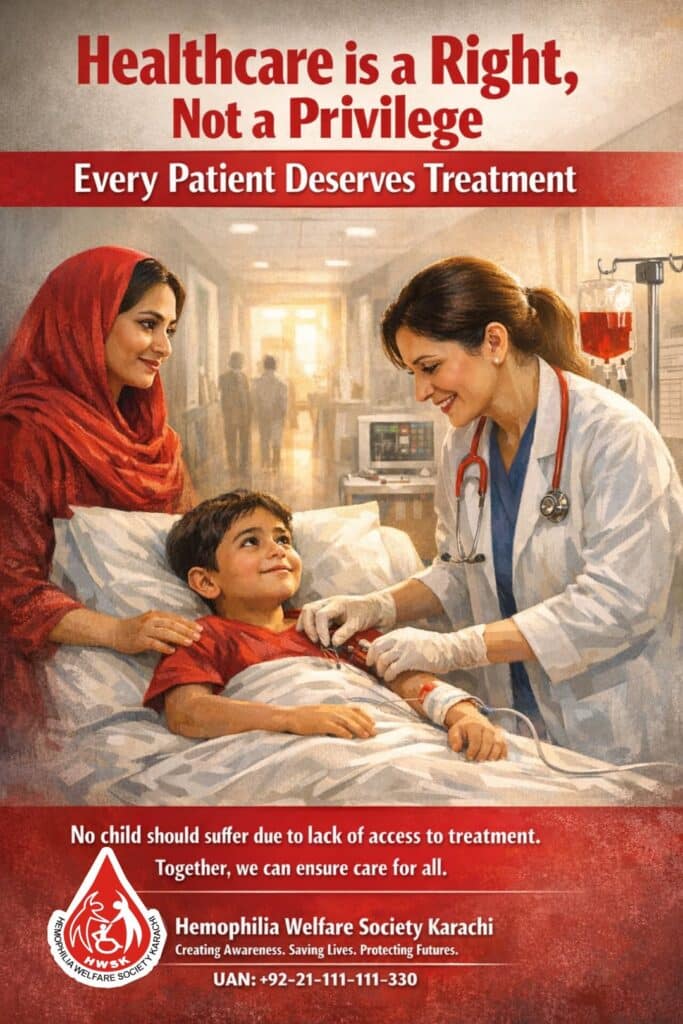
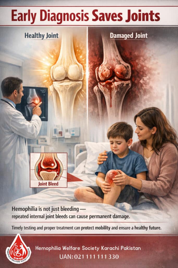
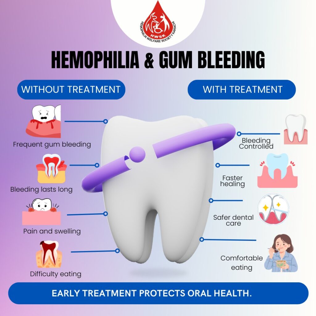
Look at the great visuals below, and ask yourself: What do I feel when I view each one? Which ones am I drawn to, and why? Which are most effective for educating, and why?

Good luck creating your visual for Hemophilia Awareness Month, and maybe in April for World Hemophilia Day on April 17!