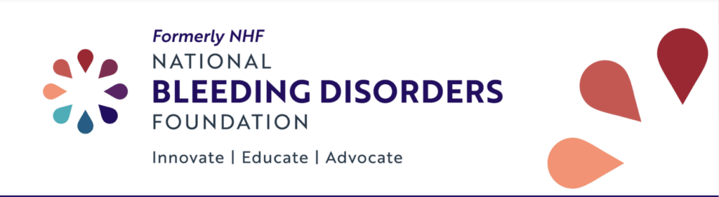
NHF’s New Name, Logo and Brand
There was an exciting development at the national bleeding disorder conference in Maryland this past week. This is the largest gathering of our community in the US, and some exciting news was announced. The National Hemophilia Foundation (NHF) has changed its name, after 75 years. Along with that, it also has a new logo.
But why? And why now?
Branding

All personalities, companies and organizations need an identity that the public recognizes and that creates positive associations. With bleeding disorders, this identity includes most likely humanitarianism, proactive behavior, and medical progress.
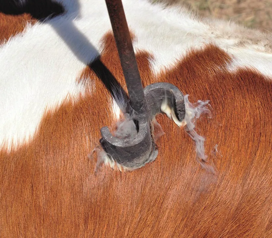
Identity is reinforced through marketing materials—a logo, business cards, website, and stationery, which all symbolize and define. This is called branding. Branding is what farmers, cattle owners and cowboys do to their livestock and horses, in case they get lost (or stolen). A special marking is burned into the hide of the animal that easily identifies the ranch or individual owner.

For companies, the “brand” is not burned into the hide! It’s a logo—this is a design, a visual symbol that represents the organization’s identity, character, focus, and sometimes culture. Much like the colors and symbols of each country’s flag, the colors, shape and symbols of a logo say clearly who and what the company or organization is.
A logo is one of the main components of branding and should be created after the mission and vision are created. NHF already had a logo, in use for decades. It was replicated around the world too, with the World Federation of Hemophilia, and various chapters and other countries. The logo, in various forms, showed the outline of a human, white inside, leaning on the figure of a person, with red inside. Clearly, people without factor leaning on a person with factor. Over time, the board of NHF decided this was a bit negative, and changed the logo to two upright figures, one white and one read, with arms about one another. Supporting but not dependent.
Brands Evoke Emotions
And the reason for that change is emotional connotation. What emotions did the leaning, white figure conjure up? Weakness? Dependency?
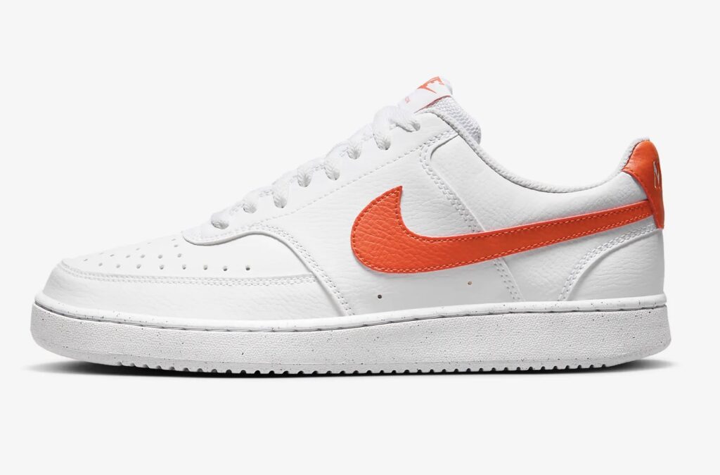
An effective logo elicits an emotional response that creates positive associations. Footwear manufacturer Nike uses a simple “swoosh” design that is contemporary, upbeat, and active, implying energy and speed. The logo of the United Nations depicts olive branches, a sign of peace, embracing the earth.
Even with the positive connotations of the two figures being equal and embracing, NHF decided that this too was outdated. And logos can be updated to reflect changing sentiments and beliefs. Time for a change!
Inclusivity, Welcoming
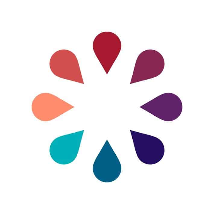
The new logo is interesting, and reflects changes in the mission of NHF. NHF is no longer just about hemophilia. It is now the National Bleeding Disorders Foundation (NBDF). This title infers inclusivity, which is not only a catchword and movement in society today, but has vital ramifications for our community. NHF implies (and states) hemophilia. NBDF implies and states: hemophilia, rarer bleeding disorders, von Willebrand disease, women with hemophilia, and more.
The new logo reflects this. It has changed from two figures, which is a concrete representation, to the more abstract circle of blood drops. This reflects a more graphic representation of our community. More beautiful is the decision to make the blood drops a palette of colors. To me, this represents diversity, also a catchword and movement in society. Inclusive of ethnicity, gender fluidity, language, heritage, and more.
In logo creation, circles are more fluid than squares; circles are softer, used to represent continuity and eternity, and in general more pleasing to the eye than angular shapes like triangles and squares.
This simple logo with multiple colors is a great choice and can more easily be used in marketing in dozens of ways. By the way, NBDF’s new tagline is a slight variation of one I’ve been using for about 20 years, Mine is Education, Innovation, Compassion.
Change is hard for many to accept. Let’s see how the community reacts to this name change and new logo. I hope it is as positive as the new logo feels to me.