Facts and Figures, Emotions and Reason
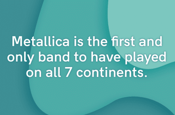
I don’t have many phone apps, but one I love is called Facts. Every day, I receive a unique fact in white lettering on a pretty background. The facts tend to be trivia, such as “A group of rhinos is called a crash.” Or, “Metallica is the first and only band to have played on all 7 continents.” (Who knew?)
Yesterday, the fact read, “We keep believing things, even when we know they’re wrong. Social manipulation can alter memory and extend the amygdala to encompass socially mediated memory distortions.”
This message seems a dire warning of the dangers of social media. We all want the facts—truth. And the truth is hard to discern amidst a rampant pandemic that has so far killed over 154,000 Americans. My friends on Facebook want to make sense of what is happening, and in doing so, post and repost graphics and statements that seem contradictory at best, and dead wrong at worst. It reminds me so much of the years of the HIV epidemic, where fear took over common sense and critical thinking.
“Mathematics allows for no hypocrisy and no vagueness,” said the French writer Stendhal. Mathematics is said to be pure, logical, apolitical. But statistics… that is entirely different. Statistics uses math to reveal patterns and relevance. Statistics can be manipulated, presented in a half-light. Statistics can be used to support an argument, but can also be used to refute the same argument. Who to believe? And when you have a pandemic in an election year, with emotions running high, statistics are tossed about as truth. When I start seeing statistics and patterns of numbers presented on Facebook by my friends, I begin to wonder what they are trying to say or prove.
For example, one colleague in late April posted a chart from the CDC showing that the combined COVID-19 and pneumonia and flu deaths were about 94,000. She gloated that the CDC “lied” because there were not 94,000 dead from just COVID, as stated in the news, but that the total included other disease states. I politely questioned her statement, and pointed out that the current COVID death toll of 94,000 at the end of April was not the same as the 94,000 figure she was using. The CDC data she was using was from early April. In a matter of a few weeks, the death toll had skyrocketed. An easy mistake to make, but she was comparing incorrect numbers. Instead of thinking about this, she accused me of driving an agenda to match “my own narrative.” Yet, while I have not ever posted anything of a political nature on social media, that’s all she was doing on Facebook.
Many are now using statistics on social media to do just that, support a narrative, usually political. It makes me wonder if, during the HIV scandal years, if there had been such a contested election and polarized politics, would we be manipulating statistics so much and ignoring the public crisis? Would we tell people not to wear condoms as we now flaunt not wearing masks? Would we deny the number of people dying? We didn’t have social media then, nothing to fuel the flames of conspiracy.
Here’s another example that prompted me to write this blog:
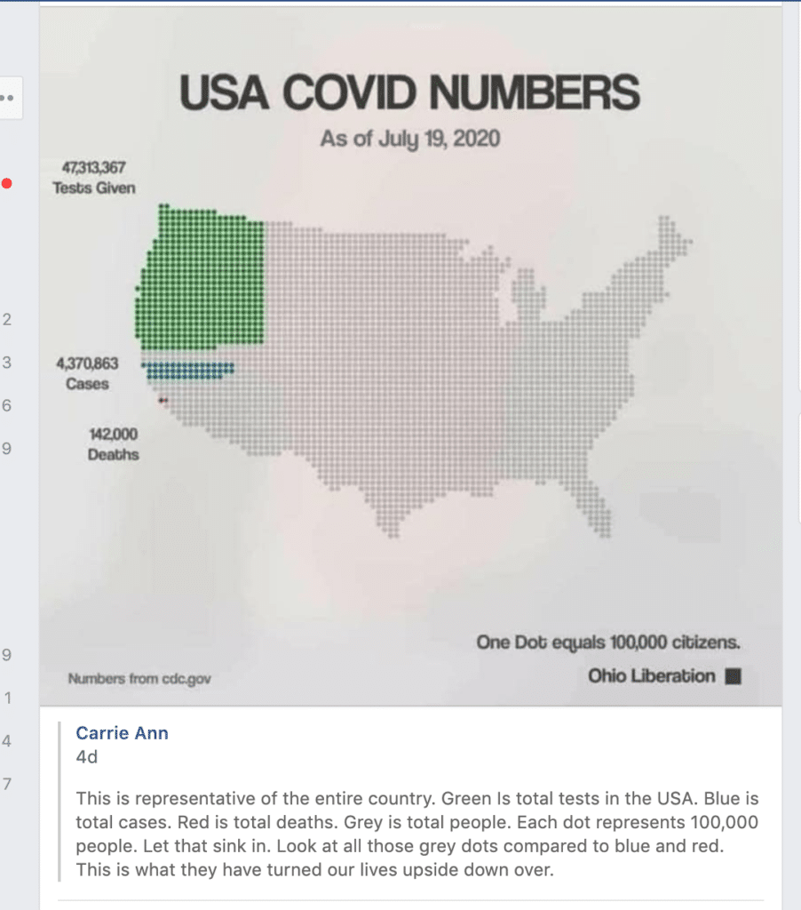
If you look at the dots on this map, such a “small” death toll does not seem too bad. The poster also insinuates that such a death toll is not worth “turning our lives upside down,” though she does not say what this means (simply wearing a mask? Or losing a livelihood?). Ask: what message is she trying to say? What could be misleading about this?
Now think of the HIV epidemic, which wiped out half of our community. We lost 10,000 people over a number of years. That would barely be visible on this map. One lone little grey dot. Yet, it decimated us. It led our community to advocate and this led to permanent changes in how blood is collected, tested and distributed, for the betterment of all.
And now think of this map from this perspective: with 1,000 Americans dying daily, it’s as if three loaded jumbo jets are crashing every, single day… for months.
What’s missing from Carrie Ann’s map is time. And this is important. Here’s more perspective: 154,000 dead from COVID in four months is almost as much as the 157,000 dead in over 20 years of the Vietnam War. Top medical experts are now saying we could hit 200,000 Americans dead by fall. This is about one-third of all US deaths from HIV in the past 38 years.
Now get away from a snapshot of a map, and look at trends below:
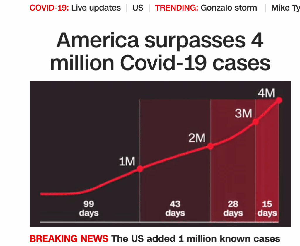
The virus is exploding exponentially in number of cases. And eventually, in number of deaths, until a vaccine is approved. Or not? Could it be that cases are exploding and will continue while the death rate might level off at some point?
So why do people latch on to a map, or one graph, or fail to compare, contrast, and critically review what is posted and reposted on Facebook or other social media?
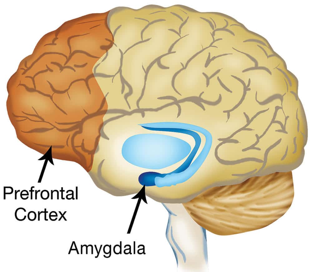
Perhaps it does has to do with the amygdala. The little organ in the brain responsible for the “fight or flight” reaction. The little organ that is considered the seat of emotions. It filters perceived and real threats from outside us, to help determine our next actions. Do we run away from danger? Do we stand and fight? We see political posts, and fearful posts about COVID, and we stand to lose our business or loved ones, or even our favorite elected official, yet we no longer can fight physically from a computer. Instead, we attack via posts. Whatever we do, it’s usually an emotional response.
What overrides the amygdala is the grey matter, the frontal lobe, the prefrontal cortex, the seat of reason. Far too many people seem to be allowing the grey matter to take a back seat. Instead, the constant barrage of posts on social media act like physical threats to us, and we react emotionally by twisting statistics or simply reposting something without stopping to ask: Is this true? Does this present facts in the right perspective? What is the source of the post? Are they credible? Could I be wrong? What is a better way to say this, or present this?
Or more importantly: are my beliefs (political, religious) filtering the statistics and making me use them to support my beliefs or “narrative,” or will I allow the information to challenge my beliefs?
One community member posted this, which sarcastically challenged the statistics people had been tossing about, and put things in perspective:
Even if the fatality rate of children in school due to Covid-19 is “only 1%”, there were 56.6 million kids enrolled in school in the US last year. 1% of that is 566,000, or just slightly less than the population of the entire state of Wyoming. But it’s fine, right? It’s just 1%, right?
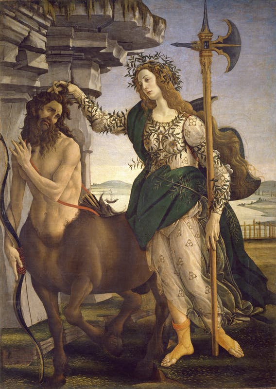
When you first enter my house, you may notice a framed picture hanging on the wall. It’s one of my favorites. “Pallas and the Centaur” by Renaissance artist Botticelli shows the Greek goddess Pallas Athena, goddess of knowledge and wisdom, with her hand on the head of a centaur. Her beauty and cleanliness is in contrast to the horseman’s hirsute body and tortured facial expression. The mythological centaurs were believed to be lusty, passion-filled creatures, all emotion. While there are many interpretations, I regard the painting as meaning knowledge and rational thought can and should override baser emotions, like lust, anger and hatred, for the betterment of humankind.
Maybe I’m just feeding my own narrative, but I think we could use more critical thinking when we use social media; more rational thought than emotional reactivism; and more recognition that one life does matter. It’s not all about statistics. Each of the 154,000 represents a loved one, and we still have time to save the other 50,000 or more in danger.
“If you can’t find the right answer, first you identify all the wrong ones”. -Joan Clarke, The Imitation Game